Style First, Then Placement
CMI
Product Demonstration Videos with Spokesperson
Picking the right format for your audience is step one. Step two is putting that video on the page where it actually moves the needle: homepage, landing page, product URL, or training hub.
Talking Heads’ guide How to Choose the Right Video Style for Your Audience maps awareness, message job, and channel to styles like Funny Ads, whiteboard, product demos, VSLs, animation, and elearning. Use that matcher first.
This article builds on that decision: once you know the style, here is where each format belongs on a website and when a website spokesperson is the conversion piece of the stack.
Product Demonstration Videos with Spokesperson
Do not invent placement before you know the job. The Talking Heads style guide asks three questions: how aware is the viewer, what must they understand, and where will they watch. Their quick matcher pairs cold social traffic with Funny Ads or motion graphics, complex B2B ideas with whiteboard or custom animation, product proof with demos or app walkthroughs, and high-trust offers with VSLs and presentations.
Read the full breakdown: including watch-fors for each style: on choose the right video style for your audience. Everything below assumes you already have a shortlist from that guide.
A funny ad that wins on Meta will underperform as a silent homepage hero. A VSL that closes on a long landing page will feel heavy in a feed. Whiteboard that teaches procurement will bore cold scrollers.
Style solves the communication job. Placement solves the page job. You need both aligned or you burn production budget on the wrong URL.
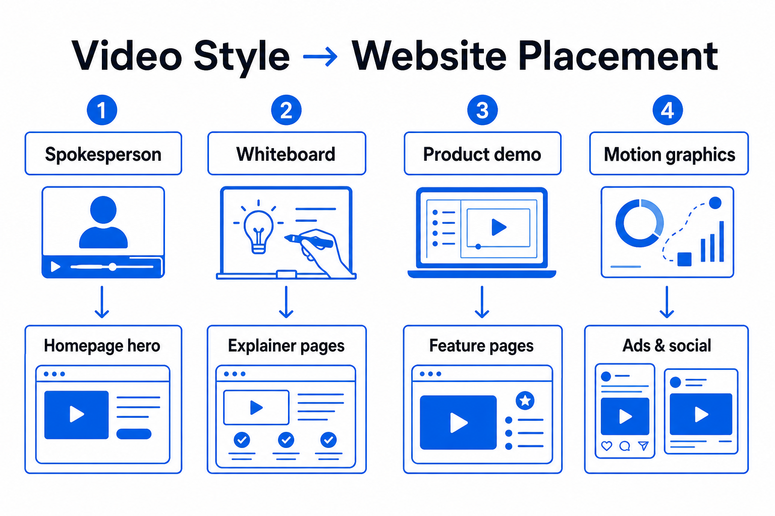
Use this as the website layer on top of the audience matcher. Fine-tune with your analytics: bounce rate, CTA clicks, and play rate on each URL.
Best pages: homepage welcome, service landers, pricing explainers, paid-campaign post-click URLs. Job: trust + one CTA. Keep scripts 30–90 seconds. See how a website spokesperson increases conversions.
Best pages: How It Works, SaaS concept pages, investor/partner education, mid-funnel blog embeds. Job: teach a process before the ask. Pair with a short spokesperson CTA on the same page or the next click. See whiteboard video options and custom animation.
Best pages: feature pages, pricing comparison, trial signup, product-led growth onboarding. Job: show “how yours works” after category awareness. Open with the outcome, then the UI. Browse product demonstrations and app walkthroughs.
Best pages: campaign landers that continue the ad message; short loops above the fold for brand energy. Job: attention. Hand trust and offer detail to a spokesperson or demo deeper on the page. See motion design examples.
Best pages: brand story, product internals you cannot film, before/after transformations. Job: visual metaphor. Keep a text CTA and optional live spokesperson for high-ticket close. Explore 3D animation.
Best pages: customer portals, LMS embeds, partner training hubs. Not cold homepage heroes. Job: retention and procedures. See our elearning video guide.
The Talking Heads guide recommends mixing styles across the funnel. On a website that usually looks like:
Repurpose one script across formats when the message stays the same but the visual language shifts. A 15-second social hook and a 90-second landing page video can share production roots; they should not share the same placement rules.
Choose an on-camera website spokesperson when personality and trust close the sale: services, high-ticket offers, founder-led brands, and pages where visitors need a human before they click. Use green screen when you need flexible backgrounds without reshooting the talent. Use animation when the story is hard to film or needs a consistent character world.
If you are still weighing tradeoffs, read pros vs cons of video spokespersons. If you already know you need a face on the page, focus on placement and script length before expanding to secondary styles.
Solution: Map each asset to one page intent. Do not drop a cold-traffic funny ad into a pricing page and expect conversions.
Solution: Export lengths and aspect ratios per channel, but keep page-specific cuts. Homepage welcome ≠ YouTube pre-roll ≠ Meta hook.
Solution: Every embedded style needs one visible next step: form, order, or demo request: within the first viewport.
Track metrics on the URLs where each style lives:
Pilot one high-intent page first. If a spokesperson lifts engagement, expand. If a whiteboard lifts understanding but not leads, add a short conversion clip below it or on the next page.
Style decision first. Then website placement: